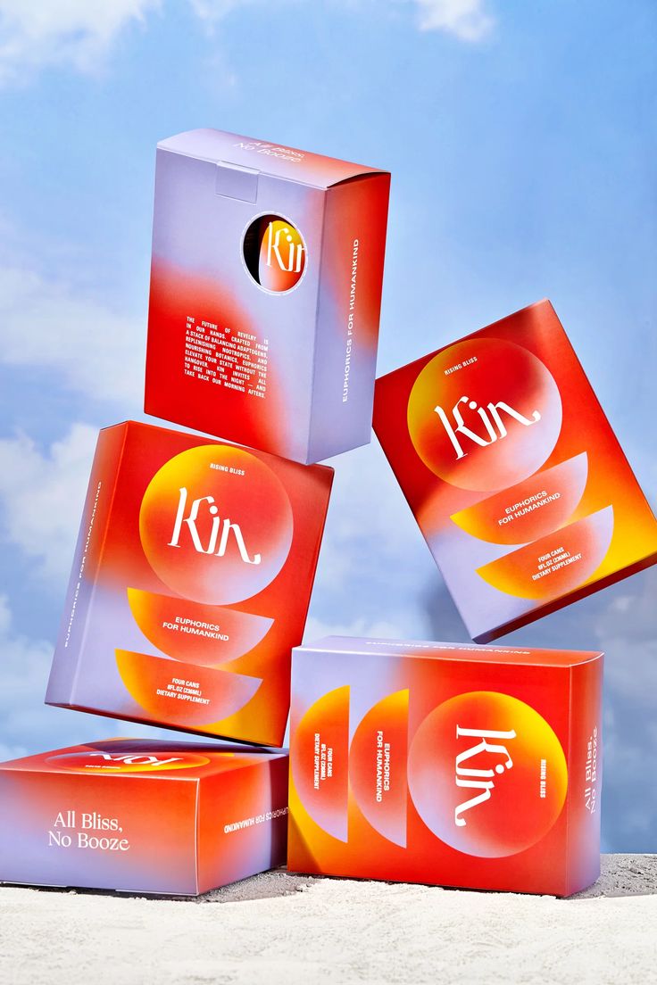
shining a spotlight on gradients, bold colors and decorative serifs taking over the health and wellness space (as well as our bedsides)
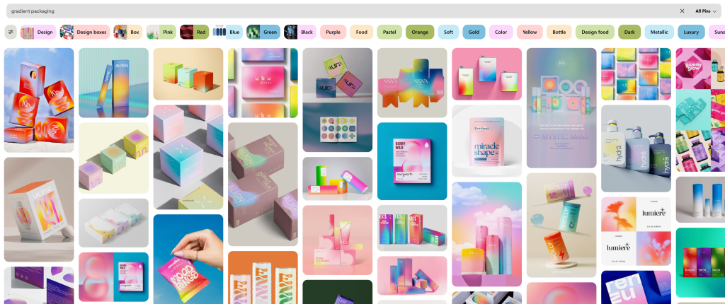
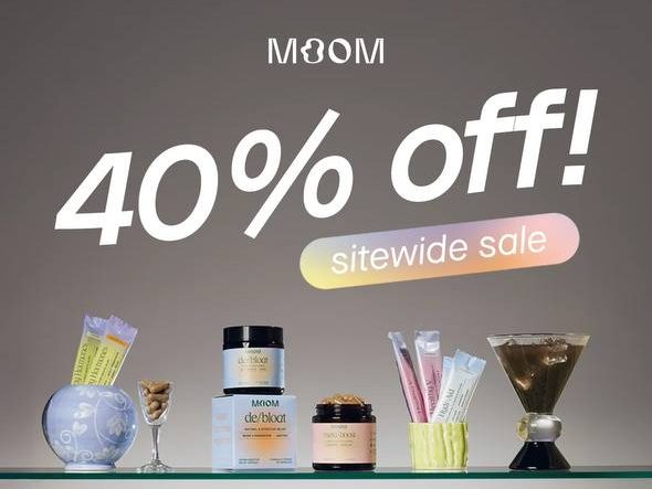
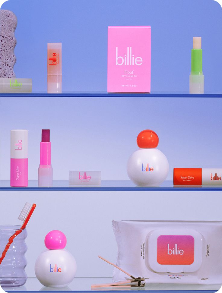
As a graphic designer who touches on many brands, ranging from FMCG packaging to building out the perfect Powerpoint presentation template, it’s part of my everyday life to seek inspiration online, look at the world around me and observe the trends that ebb and flow in and out of fashion. We all know that graphic design evolves, following trends closely and catering to the visual needs of the biggest consumer group in the current time period. Curiously, in the current age (2025), health and wellness products and services are enveloped in bright, striking colors, meshed in soft gradients, packaged neatly with a bold, decorative font on top. Vivid colors and intricate typefaces that catches our eyes with the way they stand out on the shelves and how they photograph oh-so-well on social media. A quick search for “gradient packaging” on Pinterest will turn up multitudes of different new-age supplement brands, taking up a majority of the results.
Who even buys these things
Studies have shown that more Gen-Zs prioritize health and fitness and are quickly becoming the lead consumers in the health and wellness industry globally. In China alone, Gen Z has already overtaken the post-90s cohort as the second-biggest buyer of health supplements and the buying of dietary supplements often is rising at a 61% CAGR (Spotlight on Gen Z: China’s Newest Consumers, 2024) while globally, according to the latest Gen Z State of Beauty 2024/2025 report from Kyra, 80% of Gen Z in the UK and the US now take between one and six supplements every day, with multivitamins (41%) and vitamin D (24%) leading the pack (Stat: Gen Z turn to daily supplements as wellness becomes an everyday routine, 2025). With Gen Z growing to be the leading consumers in this space, packaging designs evolve to fit their aesthetic taste but why this style in particular?
The driving force behind the design
With this uprising trend being the new face of health and wellness – what drives the need for such design over something more educational? Surely a traditional front-of-pack design with more information and science-based text and visuals would be more valuable in the health and wellness space but why do these gradient-laced packs still prevail?
Behold the “Shelfie”; where product placement thrives
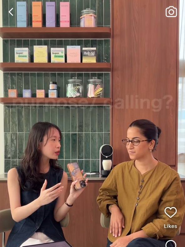
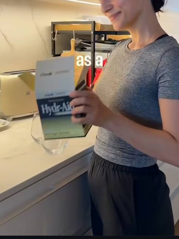
Cleverly combining “Shelf” and “Selfie”, Shelfies are photos of curated shelfs; visually represent a person’s lifestyle and interest. Although the term itself is not relatively new, with the term appearing on r/SkincareAddiction on Reddit 7 years ago, they are still relevant today. Shelfies pop up very frequently on social media, often in “over-consumption core” posts where creators flaunt 101 variants of the same product and brands using it as a concept for marketing purposes.
A subtle shelfie in the background of reels and stories used by content creators and influencers also play a part in driving this ideology where your products are meant to look good and fit into your aesthetic instead of just being what it is. Many brands often incorporate a shelf into promotional / shopping livestreams and video content to place products on, to give their settings a room-like quality to further push the narrative of setting their products into your environment.
Besides shelfies, product placement, especially in the health and wellness space, has evolved into being part of “the everyday life” where content creators, as seen with the influencers working with the brand “Bloom”, leave products laying in the background of their undisclosed ad content, to give it a more natural / authentic look and feel; as though the products are so loved, they are now part of your life beyond a sponsorship.

How a packaging looks on someone’s bedside table and how it fits into their daily aesthetic now holds value over the actual product itself.
It’s easy to connect the dots here: demand for pretty packaging + lifestyle influencers + a growing need for wellness products = gradients, decorative serifs and typography dialed to to the minimalism setting
Understanding why brands are using this style alike is simple. The designs are minimal yet inviting, drawing consumers in with a melting pot of colors, with soft edges that adds warmth to the overall look and feel, making supplements (a product where efficacy is priority and sometimes alleviate not so pleasant symptoms) look pretty and aesthetically pleasing. On top of it all, all the elements work well together to create a something akin to an art piece, bringing old school supplements to shame when placed in a home setting.
beyond the bedside
The line between wellness products and furniture is blurred especially in times where the superficial aspect of a product holds higher value than the benefits. Which brings us to the topic of “Bedside Beauties”. As graphic designers, where do we draw the line between a purposeful design versus one that simply looks good in someone’s house / everyday life? Creating a design that sells in this space requires more than just translating a sciencey brief into benefit-communicating visuals, but also a functional accessory part of the people’s daily routine. (Let’s face it, we’ve seen brands sponsoring content creators to position their supplements this way).
This further pushes design in the health and wellness sector to be more than just ailment alleviating, designs in this space now have to be deemed “curatable” and “content-worthy”. We are no longer designing for health, we are designing a centerpiece on kitchen counters, a partner to the candle on the bedside table, and a lifestyle accessory to that looks good alongside the consumer. Designs that looks good as product placement, a pretty prop in an infleuncer’s daily routine and a piece of furniture to elevate the look and feel of the consumer’s shelves.
Citations
Spotlight on Gen Z: China’s newest consumers. (2024, November 26). Investment Bank. https://www.ubs.com/global/en/investment-bank/insights-and-data/global-research/china-360/2021/spotlight-on-gen-z.html#:~:text=Gen%20Z%20has%20already%20overtaken,gym%20chains%20and%20fitness%20apps.
Gen Z turn to daily supplements as wellness becomes an everyday routine. Stat: Gen Z Turn to Daily Supplements as Wellness Becomes an Everyday Routine | LS:N Global. https://www.lsnglobal.com/news/article/32040/stat-gen-z-turn-to-daily-supplements-as-wellness-becomes-an-everyday-routine#:~:text=Stat:%20Gen%20Z%20turn%20to%20daily%20supplements%20as%20wellness%20becomes%20an%20everyday%20routine.&text=According%20to%20the%20latest%20Gen%20Z%20State,and%20vitamin%20D%20(24%25)%20leading%20the%20pack.

Leave a comment